Sam Schonzeit is an artist, teacher and architect living and working in Marfa, Texas. This interview was compiled from a series of emails with the artist. Because of the diversity of Schonzeit’s work and interests, as well as the rapidity of change in the material, formal, and conceptual components that define his work, this interview documents only one particular moment in Schonzeit’s practice, a moment I am sure he has already digested and transformed into new work.
This interview focuses mainly on Schonzeit’s postcards and attempts to explore some of the various threads of this body of work. To fully explore all the elements of Schonzeit’s practice in an interview would require, not only a much longer interview, but also a much stranger interview. This I hope we will accomplish in the future, but for now, here is a portion of the whole.
January 2012
How do you describe the type of art that you make?
I like this. Thanks for asking.
I do several types of work and I am not sure if any of them are really art. Not that I really have a tremendously good idea of what constitutes art or even more what makes good art if there is such a thing.
Simply, when people ask me what kind of work I make I say I paint with spray paint or I make concrete lamps or I make postcards. Or I have a subscription art service.

I wonder if the postcards are art works because they have a function. I feel I design them in a way. But they evolve and I experiment with them. Can art have function like that? I guess. I also like to think of the art as being accessible both in terms of content and price. Accessible art. Art for people. The people. I like to think of the postcards circulating through the postal system and the postal workers seeing it. I don’t know if that happens. Then I like thinking that the postcards start out here and then someone buys one and sends it through the audience of the postal system and then someone gets it and then puts it on their fridge. OR maybe they throw it away but that’s less interesting to me.
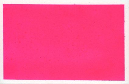
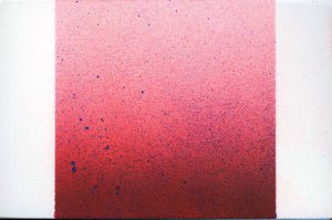
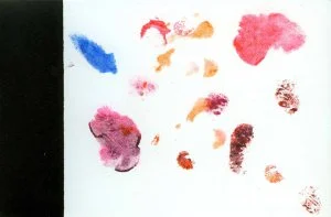
Sometimes I say I am interested in gradients. But now with the new paint I am interested in solid colors.
With the subscription cards (and by the way I may not “describe the type of art that [I] make”, I mean this might be the first time) I am continuing in two vanes that I have worked in in the past or have been working on in the recent past. The idea of a postcard ,which is nice because it is small and thus fast and easily stored and cheap to make and can function as a tool (a communication tool). The tool aspect means to me I can say its a postcard and not art if I am feeling bashful. But also this is a message in a bottle project similar to my “Would you like to Receive a Daily Picture of Me at Work” project which I did 3-4 years ago when I was working in an architecture firm Austin. The project was some sort of odd attempt at communication, which I did through email. Sort of from the isolation of the office. This sense of displacement there.
So now I am sending out cards to people who subscribe. From this little island of a desert town. Each unique. Each month I work in a different theme. Last month was food in plastic boxes, the month before was wood and linoleum facades, and the first month was experiments with spray paint and text that spoke to the mundane quality of the mail. Someone asked me what the concept was behind sending food in clear plastic boxes. I said I didn’t know. Its fun! Its a bit of a prank a bit of see if you can get away with it. A bit of see if it will go through and see how it comes out the other side and what will people do with the food once they receive it. Will they add milk to the lucky charms? pop the popcorn? chew the gum?
The daily picture project was free accepting a book that I sold with the first 100 photos and a an interview I did with Mike Wachs in MEW. This postcard project people actually have to pay for the service. Which I think is fine. I think people should pay for art. I think artists should be supported because they are an important part of society. I don’t think artists need to be tremendously wealthy in the same way I don’t think anyone needs to be tremendously wealthy but they should be able to survive and do their work. So I think this project is a nice way for people to support an artist and get art that is made specifically for them (in a way).
I want to ask you about the formal features of your postcards. You work within the particular constraints of the size of a traditional rectangular postcard (approximately 3.5 x 5.5 inches). Three particular interests stand out in my mind: color, line, and text. Why these particular features?
I think that these concerns have very little to do with the postcard and more to do with my general interests. With the gradient spray paint cards the postcard sort of facilitated that exploration because the gradients were easier to execute in a small place. But maybe that is the answer to your next question. Why am I interested in these sort of boiled down forms. Color to me is in a way the antidote to line. Spray paint the mess to the inked line or the pencil line drawn with a straight edge. I feel like shape came later with these sort of arbitrary forms created by spraying a lot of paint in one spot and letting the air determine the resultant shape. Air as a medium. Always liked that in cooking air could be an ingredient.

But with shape the first cards were my car cutouts and those were really all about shape.
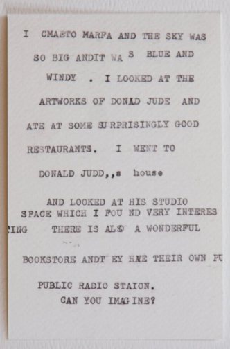
I don’t think of the text cards as TEXT. I think of them as some vague expression of something. The postcards were mostly the sentiments of imagined tourists. Which I have been here. They are my musings filtered through the people I serve in the restaurant. So maybe that something is the discoveries of the tourist but the tourist has some of the insight gained by living in the place they are encountering for the first time.
I mean yes I am concerned with all of these elements of art. And sort of like one of those compartmentalized plates I am keeping my food separate. Recently though I have been doing larger works that combine line and color. I guess I think of them as separate disciplines. Sometimes I can put one on top of the other.
Does the size constraint of the postcard have a particular effect on your stylistic decisions?
With regard to gradients as I said above it is a facilitator. I believe I have only ever heard of constraints being freeing. I mean I have always found them freeing. Deciding on a format means one less thing to consider. Also for a person with considerable little patience the card allows me to finish things quickly. The format allows me both to keep it simple and to be complex but with the knowledge that I will be able to complete it.
With the text pieces it helps to know that I have this very limited space to say what it is that I want to say.

Have you found one mode more interesting then others?
The spray paint I think has been the most interesting in terms of technique. I have noticed a real progression and there are different modes of application and different materials that I have had to learn how to use.
Also the written cards because they seem to take on this personality that I didn’t really know that I possessed. As I said before, like a tourist who arrives somewhere for the first time but has this knowledge of place somehow. Who is that narrator? Also thinking about space in those pieces and punchlines almost. Japanese ink wash of literature. Big distances little indicators fill in space.
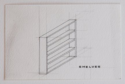
The line drawings are more meditative more compulsive. More Obsessive. I almost do them to settle my mind. I found the few furniture cards I did to be interesting and don’t really know why I haven’t done more of those. I mean I did thirty of them on that one sheet but I am not separating them. those were funny because again it was about this supreme simplicity of representation. That a rug for example is indicated with 4 lines. Funny.
Also funny those hole cards.

Have you seen a progression in style or interest from your first postcard works (perhaps, the cut out circle?) to the spray paint based and text works?
Well I have gone from 140lb water color paper to bristol board. I have started using tape in my spray paint cards and there playing a little more with the picture postcard trope. This idea of a framed image. And then to begin focusing on the frame as opposed to the content within. I think its interesting to be amassing these stylistic tools. And then to see how I will use them. I have done many more of the spray paint cards than any of the others so it makes sense that they have had the most meandering path.
Is there anything about the format that you find frustrating, or things that you’d like to do with the postcard, but now realize it can only be done in another format or media?
I like that if I find the format frustrating that I can change the format and still call it a postcard like how Gilbert and George called all of there performances “sculptures” which i love. I think everything can be a postcard. I have been exploring that a little bit with my postcard of the month subscriptions where in June I sent out transparent boxes of foods. That’s one side of it.
The other side is if there is something that I want to do and it won’t fit on a postcard than I will just put it on something else.
I guess I also find it a little frustrating that I get bitten by this sort of cowardice and whoredom that accompanies creating something that is a commodity. This idea that I want everyone to have one and price them as expensive postcards as opposed to inexpensive art works means that in certain instances I think that the work is incredibly undervalued. Once the cards become 5.5″ square I can sell them for much more. But then they don’t fit in a rack and I need to find a different venue.

